Interfacing with UI #4 – Coherent UI

This is part of a series of posts revolving around user interface design and development, the introduction and links to the other posts can be found here.

Last I wrote about user interfaces I discussed the new Unity UI system and I wrote about our process of porting from Daikon Forge to it. That was a year and a half ago and a lot has changed since then. To keep things interesting we decided to move from Unity UI (yet another move?!) to Coherent UI and I’ll explain why we did it.

Why Move… Again?!

Changing UI library is no small task and it’s definitely not something to be undertaken lightly, especially twice in the same project. So… why did we move? Ultimately it came down to two main points.

We found Unity’s UI was not up to standard at the time

When Unity UI came out I started porting our mod tools over to it. Whilst doing this I encountered a lack of functionality and lots of bugs. The framework was far from mature and lacked a lot of features and functionality you would come to expect from a UI middleware. Unity open sourced it, which was a great move, but even today there is functionality and features missing and the workflow just didn’t fit what we wanted.

We needed a mod friendly UI system

This is an especially important point. As you may know by now flexible mod support is one of our core design pillars for Solitude and Unity UI just isn’t mod friendly one bit. It’s heavily Unity Editor based and, while you can set up the UI at runtime, it takes a lot of code to achieve simple, reliable results. We needed something that modders could easily edit, play around with and get into the game. The only way we could manage that would be for us to write a layout tool as part of the game mod tools and a converter for changing this custom layout format into Unity UI. To be blunt – that wasn’t going to happen. We’re too busy with critical features as it is so having to write a UI converter would be too much work for us.

So I decided to expand our search which lead to me find Coherent UI.

Coherent Labs

Coherent UI

Coherent UI is a user interface middleware developed by Coherent Labs. It integrates a wrapped chromium renderer (think: Chrome web browser) to provide HTML, CSS and Javascript support for user interfaces. I took to my research and after a few example projects I quickly realised how perfect for Solitude this would be. This was in January 2015.

Coherent provided loading of UI in the form of HTML, CSS, Javascript, the bindings and hooks for linking the renderer into Unity but it didn’t provide any kind of complex framework for controlling all these. To keep inline with our mod support design pillar we needed a flexible system for modders to define user interface components that can be loaded and removed from the game. It took us a few weeks of solid development effort but after we had finished we had a framework that allowed us to create user interface components and bind them to the game. Not just that! We were able to separate the UI logic from the components so the UI logic stayed in the Lua mod scripting layer and the pure view stayed in the JavaScript code.

This framework proved to be very flexible and allows modders to inject their UI mods into the core Solitude game, or provide UI functionality for more extensive mods they create all in a well known format. It even allows for real web browsing! (We’re limiting that for the core game but modders are welcome to unlock it with a simple change).

The downside to Coherent UI was that it is closed source and is expensive for a small company of our size. For a larger company it’s very reasonable in cost. At the time we took the subscription approach with the intention of upgrading to a full game license when we had the funds for it.

So, what else could we do with Coherent? Well… it allowed us to truly get the most out of Solitude’s terminal system. Solitude Tech Demo 1 had terminals but they were more faked as they weren’t sync’ed up for multiplayer support and they were definitely not moddable. So with Coherent it allowed us to get to our Terminals 2.0!

Terminals

As we were pushing Coherent hard we started to feel some performance issues in two mains areas. We plan to have a lot of these terminals in one area at any one time and we intended to show in-game video feeds (view screens) on them too. Both of these areas were causing us performance issues and were a cause for concern. Coupled with that, Coherent informed us that the subscription tier was to be end-of-life’ed and, after the time extension they offered us, we would have to upgrade. Since a time extension of a year wouldn’t cover us for the release of Solitude we decided to upgrade with the subscriber discount they provided.

Coherent GT

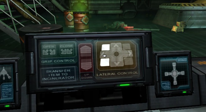
During this time Coherent suggested we try their new version of Coherent called Coherent GT. This apparently brought with it a lot of performance improvements so I spent some time investigating it. I was very happy with what I found as it solved both performance issues that were a concern for me only a few weeks earlier! With that, we fully upgraded to Coherent GT! This allowed us to fully implement viewscreens in Solitude.

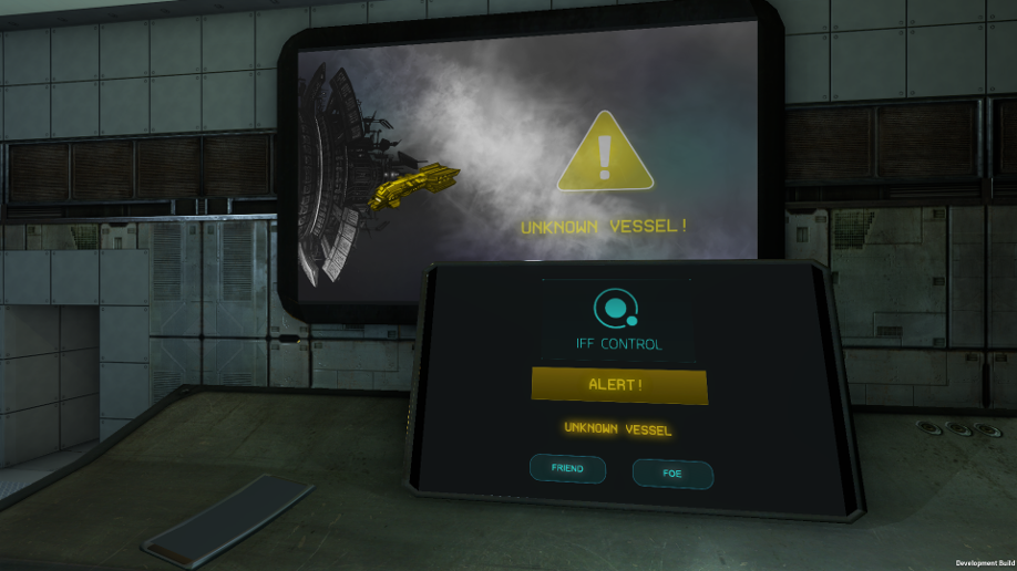
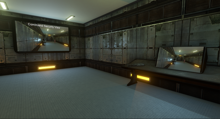
The terminal viewscreen feed is fully embedded in the terminal HTML (DOM) structure, so you can easily manipulate it with JavaScript and overlay any user interface on top of it like you usually would on the terminals. Here is a very basic example of an in-game camera module on the wall (it’s to the right of the large viewscreen) with the view being shared between two terminals with the viewscreen feed on it and a basic overlay.

View Screens

So there we have it. We’re not changing UI system again and Coherent is, without a doubt, the best fit for us. We get to use a technology that mastered scaling and aspect ratios long ago (web development), access to all the Javascript libraries that exist, a fast and multi-core UI renderer and a system that is fully moddable. Sounds like a win to me.

I’ll make another post to go into the terminal system in more detail as there’s a lot of things going on there. Hopefully you found this interesting and, like usual, comment, email or grab me on Twitter at @CWolf.

Thanks for reading!

Interfacing with UI #3 – uGUI – Beta First Impressions

This is part of a series of posts revolving around user interface design and development, the introduction and links to the other posts can be found here.

With this post I want to talk about my first impressions when using Unity 4.6 Beta 18, specifically relating to uGUI. Everyone should realise that uGUI is still in beta and is improving with every beta release. I’m sure a lot of issues will be fixed but my post will be a snapshot of how things are now and my thoughts. As a side note to tie up my previous posts, with the death of Daikon Forge and no longer any hope of DF-GUI v2 we’re moving full steam ahead with uGUI. With that, let’s get to it.

I’ve been using uGUI, Unity’s long awaited new user interface framework, for the past week. I’ve been developing Techyard’s (Solitude’s mod / dev tool) new user interface with it. Generally it’s not been a too painful experience but I’m making slower progress than I had hoped. Part of this is the usual learning curve of a new middleware but also due to the current state of uGUI.

uGUI is excellent in that it’s free and integrated into Unity. What I am most happy with is that Unity has decided to open source uGUI on the official release of Unity 4.6. This is amazing news as there is already an active community forming around uGUI and, with community involvement, I fully expect some excellent extensions and modifications to appear. Even during the past week people have been sharing some excellent scripts to supplement the framework.

The system is relatively easy to use from the Editor and makes use of a visual anchor system that seems to work pretty well. Exact position can be a bit of a pain though as dragging the anchors never gives exact positions – it’s all very ‘close enough’, which isn’t nice. Corrections are always needed in the components if you want exact numbers. Since Solitude will create most of its UI programmatically I think the anchor system might be more of a foe than a friend, but I haven’t done enough 100% programmatically to say for sure yet. Scaling seems to work fine, even if it’s basic support right now, but aspect ratio support could do with some extra work. Luckily, Unity have mentioned scaling is a focus soon and, hopefully, this will include better aspect ratio support. While images can be selected to maintain their aspect ratio I think this functionality would be very useful at a higher level.

Currently uGUI provides a few basic UI components but little to none of the more complex ones. Most of my time has been recreating the more complex UI components in a reusable way and converting the previous Daikon Forge UI to uGUI. I’m been making decent progress on this so the Techard UI work should speed up as times goes on.

Like most Unity-based UI frameworks, small things exist that annoy. The main thing I get tired of is that you can’t increase the size of a UI panel without scaling the content inside it too. Imagine when you create a panel then realise you want to add more content into it. Resizing the panel scales the content inside, even when the anchors are not set to scale. This use-case can be a pain. There may be a trick to unhooking the anchors before you do this but I’ve seen this exact behaviour with all UI frameworks and it’s a pain. The only ‘fix’ is to remove the content from the panel, resize the panel and then add the content back in. Hopefully Unity, or the community, come up with a better solution (or I find my mistake). I’ll probably look into this issue in more depth soon. Things aren’t bad, just fiddly.

Performance seems good for now. uGUI has better CPU performance than Daikon Forge but the draw calls can be a bit higher depending on how things have been set up previously. Sometimes a single draw call on NGUI / Daikon Forge can come in at four draw calls. I have a feeling things get better for uGUI with more complex UIs though so I’m not worried about this at all. Render order is taken from Unity hierarchy order so this change will be new for a lot of people. I’m pretty sure I’ve seen what is a rendering order bug but need to submit that to be sure of it.

All in all, it’s great to see the shift in Unity’s closed communication attitude of the past few years. The past six months have seen Unity allowing their team to talk much more openly about what is going on. This is very evident in the Unity 4.6 Beta forum where Unity are taking a lot of time to help developers having issues with uGUI. This is a good sign for the future.

I’ve had my fair number of problems with uGUI but it’s only the second week of the beta. If I’m completely honest I would have hoped that uGUI would be in a better state considering how long it has taken them to make. I guess recoding it three times over does tend to reduce a feature set. I do have to keep reminding myself it’s still a beta and not to be too harsh though. A lot of these problems will be sorted out so we’ll be sticking with uGUI for the immediate future. It’s probably worth using uGUI if you’re starting a new project but I wouldn’t recommend ripping out UI in an existing project just yet. It’s great to see Unity take positive steps on the UI and I look forward to the source being released.

Announcing Solitude, A Coop Space Survival Game

After months of blog posts alluding to our current game in development, we’re ready to let everyone know what we’re up to. Announcing…

Emergency Repairs Wallpaper

Solitude is a cooperative multiplayer action survival game set in space. We’re a big fan of space games and feel there aren’t enough cooperative games out there, however players may play on their own if they choose to do so with computer controlled crew mates. The game is played from a first person perspective as a crew member of the Solitude.

In Solitude, you and your crew find yourself stranded on the other side of the galaxy after humanity’s first experimental warp drive malfunction. Now alone in unknown space, it is the job of the crew to repair the ship and begin the long journey home.

Solitude is one of the games we’ve been wanting to make for a long time now and we’re finally in a position where we’re able take it on as our main game development project. We’ll be releasing information and blog posts about it over the coming months but for more detailed information visit the Solitude website. You’ll also be able to follow our progress in more detail with the Solitude Facebook page and Twitter account too!

As you may know we’re heading to the Wales Games Development Show this year and we’ll be bringing a Solitude tech demo with us. If you’re going to be there come say hi and check it out!

Interfacing with UI #2 – Scalability & Aspect Ratios

This is part of a series of posts revolving around user interface design and development, the introduction and links to the other posts can be found here.

The first article in this series discussed the different libraries that exist and the pros and cons of both. In this article I’ll explain the choice of UI library we selected for our current game in development and how we tackled the scalability and aspect ratios problem of UI design and implementation.


Our Library Choice

Daikon Forge GUI

Based off the information discussed in the last article, we decided to go with Daikon Forge UI framework (DF-GUI) for our game. For all the good and bad, DF-GUI is a raster based library for Unity. Along with all the previously discussed advantages we felt the source code access was crucial so we could maintain ownership over our codebase. While we would have been able to obtain the source code to some of the vector based libraries the cost was prohibitively expensive. This limits us from some of the nicer vector libraries but as long as this is planned for, it isn’t a major problem.

It’s important to note that DF-GUI is being redesigned from the ground up for version 2.x. If you intend to buy DF-GUI you will want to either wait until 2.x is released, which that is risky unless you’re not on a schedule, or use another library.

The rest of this article will discuss two approaches to solving scaling and aspect ratio issues and will go into our reasons for selecting the one we did. I’ll try to keep things as generic as possible.


Why not use NGUI?

Since this question may pop into a few heads I’ll tackle it straight away. NGUI is a widely used UI library for Unity. It was so widely used that Unity even hired the lead / sole developer to help them create uGUI and NGUI was used as the starting code base (even though apparently it’s changed a lot since then).

Not to go too deeply into this point I feel we should touch on it at least a little. We used NGUI 2.x in a previous project spanning seven months. While it’s a powerful UI library we found we were fighting with it every step of the way. Over the past few months NGUI has been undergoing major redesigns and features for the 3.x branch. We tried an early version of the 3.x branch out and, while the changes were improvements, we felt we were going down the same road as before. Most of the examples are completely out of date and, whilst the NGUI forums are very active, the developer support is usually limited to a single line reply. Needless to say we felt it wasn’t for us and so we decided to look for alternatives and found DF-GUI. In the end, some people are very happy with NGUI so I’d recommend you do your research into it either way.


Why not wait for uGUI?

With Unity’s very own uGUI arriving this summer in Unity 4.6 why not wait for it? One rule of thumb is to never wait for technologies to arrive to develop on. The technology usually will not arrive when it’s meant to and when it does arrive it’ll be, or do, less than you anticipated.


The Problem – Scale and Aspect Ratio

Since we are using a raster based library we accept the problems previously discussed, primarily ensuring scaling and aspect ratios don’t destroy a carefully crafted UI. So the main problem breaks down into two problems.


Pixel Perfect Scaling & Blurring

Game UIs need to scale. Without scaling you’ll end up playing games that seem to have tiny user interfaces since they were designed for smaller resolutions than you’re currently playing at. The problem when scaling a raster based UI system is that you tend to get blurry images. This is a very similar effect to when you run a game at non-native resolution and the game text and UI is slightly blurry. The term I’m using, pixel perfect scaling, is a bit of a misnomer. An image of size 200×200 pixels will only be pixel perfect if it stays at 200×200 pixel in screen space. A nine-sliced sprite, however, can be a little more flexible when it comes to being pixel perfect. This can scale and remain sharp.

Pixel Perfect Example


Aspect Ratios & Stretching

Games UIs need to accommodate the main aspect ratios that exist at the time of creation and the near future. For us at the moment we’re seeing 16:9, 16:10, 4:3 and 5:4 still being used. The difference in horizontal screen space between 16:9 and 4:3 is fairly sizable and this difference can cause some big issues with UI layouts, especially if the UI should maintain a specific user experience.


Aspect Ratio Flexible Layouts

So to fix these two problems I did a lot of research and came to the conclusion that it’s actually hard to find information on this. There seems to be two approaches, which are to ensure the entire UI can scale and stretch or adopt a safe zone aspect ratio to allow for non-stretching (but this could be extended to support stretching too).


Stretchable UI

The focus of this approach is to develop the UI so that it stretches to accommodate the different aspect ratios sensibly. The layout is entirely anchor based and would be linked to screen resolution and specific UI elements. The top level UI elements, usually panels, would be anchored to other UI panels and screen edges so when the aspect ratio changes the UI would grow and shrink accordingly. If set up well, changing the size would fill up the blank space that would otherwise appear when changing from a smaller (4:3) to larger aspect ratio (16:9).

Here we hit an important consideration to take into account. Depending on the UI design, the children of those top level panels may not be intended to be stretched. Plain sprites, as opposed to nine-sliced sprites, look bad when stretched width wise only. Think of an image for an icon for instance. On the other hand, any child panels would usually be fine to stretch as these tend to be nine-sliced sprites, but again the children of these panels may not stretch well. A mixture of fixed aspect ratio and stretch support is needed.

For us, DF-GUI’s 1.x anchor system isn’t flexible enough to support this approach very well in my opinion. Trying to construct a stretchable UI lead to a lot of frustrating days trying to ensure the aspect ratios would stretch but also maintain the overall user experience. The new NGUI 3.x anchor system would help a lot in this situation as it’s more flexible but at the time of testing NGUI 3.x there were still some issues that contributed to our choice to go with DF-GUI.

In the end, from our experience, this approach requires more development effort and testing to get right than the safe zone approach below. Even then, a lot of work needs to go into ensuring the UI is well developed for each aspect ratio so there are no large empty spaces within UI panels. This would happen when stretching a UI but not having enough content to actually fill the UI with. In this case minimum and maximum sizes would help but these would have to be computed at runtime as min / max sizes are limiting when factoring in scaling and resolution sizes.


Safe Zone UI

The focus of this approach is to develop the UI for the smallest aspect ratio but taking into account the highest resolution. Anchors are used to edge fit UI.

To help explain the logic, below is an example of the UI running at 1280×720 resolution. The implementation consists of two UI containers. The first is always set to maintain the core 4:3 aspect ratio and is coloured green. The second is set to expand to the full resolution of the game and is coloured blue.

Aspect Ratios

To allow for the maximum use of a game resolution that is not 4:3, the core UI (green) is scaled to the maximum possible resolution whilst still maintaining the 4:3 aspect ratio (this is why in the example the UI core is 960×720). The blue UI container is always at the full resolution of the game.

To use this layout the rules are:

  • All elements must fit in the core UI container when running in 4:3 aspect ratio.
  • All elements must be created within the core UI container. This maintains a consistent scale and prevents unwanted UI stretching.
  • Any elements that need to be on the edge or corners of the screen must use anchors. Anchors will position the element correctly regardless of aspect ratio by locating the corners / edges of the blue container. Even though anchored elements may be outside the core UI container, they will still be a child of it. This maintains scale and prevents stretching.


So what about if you want to stretch some UI elements in this layout? You would still be able to with a UI library that supported anchors or you developed your own. In our case, we will probably develop our own unless DF-GUI 2.x introduces a more extended anchor system.


Scaling – Dynamic Fonts

To maintain sharp fonts in the game use of dynamic fonts are a must. Traditional fonts are bitmap based and scale badly causing blurring. You either have lots of font bitmaps of different sizes, which is needless and takes up more space, or you use dynamic fonts. With dynamic fonts, Unity uses the FreeType font rendering engine to create the font texture at runtime. This helps a lot but a dynamic font set to size 12 will still be small when shown on resolutions larger than the design time resolution. The last step to correctly scale the font is having the dynamic font size actually set as:

[the design time font size] X [scale index]

This scale index would be calculated by the design time resolution compared to the current runtime resolution.


Scaling – Sprite Atlases

Since we are using a raster based UI system there will be times when a image will not scale well due to it being too small or too large. In this case we will need to use different sprite atlases and swap them in depending on the current resolution. This isn’t a great solution as it involves a whole new set of images at different resolutions but if the original sprite atlases is of high enough resolution this may not be an issue for some games. Scaling down a high resolution image is always prefered than trying to scale up a low resolution one.


Closing

The two approaches I’ve outlined along with the surrounding techniques are almost certainly not the only approaches to scaling and aspect ratios but I found very little information on this area. These are the approaches I discovered and developed upon. Hopefully this helps some of you out there. If you have similar experiences, or have different approaches I’d love to hear your thoughts. Comment, email or grab me on Twitter at @CWolf.

Thanks for reading.

Interfacing with UI #1 – Structure and Libraries

This is part of a series of posts revolving around user interface design and development, the introduction and links to the other posts can be found here.

During the development of our current game I’ve been tackling the user interface. This post outlines some issues involved with creating a pixel perfect scalable user interface that also handles the different aspect ratios whilst maintaining a consistent look and feel. (A bit of a mouthful, right?). Some of the article will be specific to Unity as this is our current development engine but, hopefully, even if you’re not using Unity you’ll be able to take something useful away.


Libraries vs. Bespoke

The first decision that will affect your ability to achieve the best possible UI will be a typical development question.

Shall I use a library or build my own?


Each development team approach this question differently but there are some key points to consider. There is the usual trade off between how big your budget is, how many developers are involved on the project and how long the project schedule is. Even if you can afford to dedicate a developer for a few months to develop a custom UI system from scratch, is that really the best use of their time and your money? I’d say it usually isn’t unless you’re planning a lot of revolutionary features that none of the existing libraries provide. This usually isn’t the case.

Now I’ll play devil’s advocate. If you decide to go with a library, what about the features, maintenance, extendibility and future roadmap? Is there much use using a library that you can’t extend or fix yourself? What if the updates are released further and further apart? Those aren’t ideal situations so each of these points are worth some consideration. Any one of them might have a major impact on your game.

For us, a two person team, building our own UI system just isn’t viable. It would take a single developer many months of full time development to achieve the functionality that is available in existing libraries. In our case we’re happy with functionality provided by some UI libraries, however, we made sure that the source code was available in case we ever wanted to branch development.


Vector vs. Raster (Bitmap)

When selecting or building a UI system a choice will need to be made on what image format will be used. Will the system support vector, raster or both? For this article I’ll assume the difference between vector and raster is known but if not there is a summary here.

There seems to be some debate on whether to use of a vector or raster based UI system. When digging deeper into developer’s preferences two Twitter conversations lead to the following comments.

You mean something like Scaleform? Too expensive. NGUI (on which uGUI is based) does a perfect job, if you do it right.

and

Smart UI dev tries to be resolution independent, supports various aspect ratios. With vector based UI, it’s not a problem.


The split in opinion comes from the fact that there isn’t a clear right or wrong choice and there very rarely is in software development. Both vector and raster based UI systems have their advantages and disadvantages independent of the file format itself. Straying into Unity specific libraries I’ll try to highlight the differences between the two systems.


Raster System (Daikon Forge, NGUI, uGUI)

The raster based libraries that exist for Unity are almost entirely drag and drop or wizard based. This makes for a very designer friendly approach, especially if the designer has limited to no programming experience. Some programmers may become frustrated with such approaches though.

Good: Better effects & depth

Raster art tends to have a much wider range of effects that can be created and applied to them compared to vector art. Very often original files that start out as vectors will eventually be rasterised so effects and textures can be applied to them to give them more depth and smooth blends in colour.

Good: Source code provided

Most, if not all, of the raster libraries provide their source code. This is an extremely important point that cannot be overemphasised. As a general rule of thumb, developers should stay away from making any local edits to a library they are using, however, there will usually be situations where a change will need to be made. With the source code this isn’t a problem but care must be taken to port the change to later versions of the library. Without the source code this turns into a big issue that slows development down and, in the worst case situation, can lead to replacing the library.

Bad: Pixel perfect scaling issues

Pixel perfect scaling for raster libraries can be a real pain. When using libraries like Daikon Forge and NGUI you’re able to turn pixel perfect on by a click of a checkbox, however, this won’t scale yet. You’ll need to combine this with anchors to ensure that the position is correct. It can take a bit of playing to get things right from my experience.

Why do you want a scaled pixel perfect UI? Without being pixel perfect you’ll have a blurry interface on anything except the designed for aspect ratio and resolution. Without scaling then the UI will seem too small or large depending on the resolution being used vs. the designed resolution.

If you are developing a game for mobile and desktop platforms then alternative images may be required for different devices based on resolution requirements. If this is the case then it’s common for sprite atlas and texture swapping to be taken into account.

Bad: Aspect ratio issues

Things tend to get worse when scaling with aspect ratios. Your UI design may be thrown completely out the window if you haven’t taken care to incorporate the supported aspect ratios. A major problem with this is UI stretching. For example, making use of anchors to achieve a scaling UI designed for a 4:3 ratio will cause a lot of stretching when playing in a 16:9 resolution unless a lot of care is taken.

Anchor systems differ considerably from Daikon Forge and NGUI (NGUI v2 and the new NGUI v3+ anchors) and in our case we developed custom anchors to help fill the gaps in functionality.


Vector System (Scaleform, NoesisGUI)

The vector based libraries that exist for Unity are a mixture of third party tool designer based and pure code based systems. A more code based approach may appeal to some developers more than a designer based approach so it’s something to consider along with the following points.

Good: Pixel perfect scaling

The better vector based libraries will handle runtime vector loading instead of buildtime vector loading. This means scaling will always be pixel perfect with very little effort on the developer. Compared to raster libraries this could save a fair amount of time and effort. Aspect ratios are still a problem but removing pixel perfect scaling from the situation makes things easier.

Good: Image sizes

Vector art have smaller file sizes than raster art due to vectors being mathematical formula based. If building a game for a platform that has limited file system space or there is a requirement to keep final build size as low as possible then a vector based system will help. Generally it won’t help in terms of memory usage as the vector art will use more memory the more complex it is and it tends to effectively draw a bitmap based off the vector data.

Bad: More expensive in price

If using a Unity library for vector UI then the prices are generally at least twice as much as the next best raster based UI library. The libraries are around the range of £250 so, for a business, this isn’t too much in reality. If your budget can cover this then it’s not a problem.

Bad: Closed source code

As explained above, not having the source code for a library can cause some major problems later in the development process. You’ll usually find the source code is available for these libraries but it’s usually for a large cost and must be negotiated for.

Bad: Cross-platform support issues

Support for multiple platforms, especially Linux, tends to be lacking. Devices like Oculus Rift aren’t supported and NoesisGUI doesn’t support consoles yet.

Neutral: Third party tools for designing layout

Scaleform uses Adobe Flash Studio (and I think a few other tools support it too) for designing the UI and this leads to a flash based UI.

NoesisGUI uses XAML and this can be hand coded or designed using Visual Studio.

While these two points aren’t really bad it does lead to reliance on more tools, some of which you have to pay for. If taking the XAML route then this isn’t a problem as you can hand code the design (or visually design it in Visual Studio) then view the UI in Noesis’ viewer. It’s just more points to be aware of.


Closing

So, as you can see there is no real right or wrong choice (or at least that’s my opinion). Whether you develop a bespoke system or use one of the two types of libraries, make sure it matches you and your team’s approach, resources and requirements.

For the next article I’ll go into what UI framework we chose and how we addressed the problems and questions raised above. If you have any questions, want to debate or just to share your experiences – grab me on Twitter at @CWolf.

Thanks for reading! 🙂

Unity Development: Monitors

In the spare time between our contract work I’ve been developing technology for our future game. One piece of tech that we feel will feature heavily in the game is interactive monitors and consoles. While going through my thoughts I immediately remembered the strong impression that was made on me when I first played Doom 3 and came across their interactive monitors. I loved how they integrated more functionality into an area of games that was traditionally just an ‘on/off’ switch-style game entity.

I wanted to create something simple and effective similar to what Doom 3 achieved.

Doom3 Monitor

So, with the decision to do some tech prototyping I went about wanting the monitors to be as flexible as possible. It’s still early days but I intend to have lots of different monitor types supported. In my eyes the system should support quick access, full focus in-environment and total immersion monitors. So, here are the initial set of types I am dwelling over:

Panels – Quick access monitors like ‘Open’ panels near to doors, lifts or single use machines. How Doom 3 did it.
Environment Monitors – The player’s view is zoomed in and locked onto it. It will still show part of the environment around it.
Fullscreen Monitors – Monitors that go into full screen mode.
Security Cams – Full screen, limited movement angles and possibly screen effects
Avatar Monitors – Full screen, full movement control (for turrets or robots/probes)

So… with those types in mind I went to create a prototype. You can see my efforts below in the Youtube video.

As you can see, it’s very early days but this proves the concept pretty well. Now… how is this implemented? As we’re using Unity Pro this is where a Pro specific feature steps in – RenderTexture. It allows a camera to render, or draw, its view to a texture. This texture then can be used on, for example, a Plane. By setting up a scene where the cubes can be viewed; the Plane can show this. By doing some raycasting on the Plane, then continuing the raycast from the intended camera – you can detect hits on the objects and then trigger the interaction.

In general this approach works well but I still have a few design choices to chew on. Firstly, while the camera and RenderTexture approach works really well for ‘real’ views such as Avatar or Security camera mode, since it’s looking at something in the ‘world’, it gets a little cloudy for the monitors and consoles. Where should the ‘view’ exist in the game scene for a monitor with just buttons / user interface options / typical computer interfaces and feedback? The two main trains of thought on this type of thing are:

Same coordinates as the monitor but on another layer for culling
This keeps the ‘view’ positionally relevant to the monitor and is easy to remember where the view is. The problem is that it feels messy to me. You can enable / disable layers in Unity so it doesn’t need to be messy but it just feels a little wrong to me, however, the ‘view’ in-game will be culled so you won’t ever see the actual ‘view’ – just the result on the monitor.

Same Position Example

Very far away from the active game world
This keeps the ‘views’ away from any active area but our game will make use of a very large in-scene area. While our game will use a very large in-scene area, ultimately, there will always be space for it somewhere far out. We’ll be loading world data in and out as the player(s) move. I’m not too comfortable with this approach though as the ‘views’ will be a little dislocated from the monitor – it feels wrong to me too.

views

The game scene is the building area of the game. The active area is what we would load game objects into. This leaves some ‘no mans land’ which we could add the monitor ‘views’ to.

I’ll have to give this issue a good bit of thought. I’m going to see if there are other options available to me that I’ve not thought up yet. I’m more inclined to go with the first option but we’ll see. One very interesting side effect I encountered has been getting an effect similar to Portal’s portals. By leaving a mouse controller active on the security camera monitor when it should be turned off gives a very similar effect to what it’s like to look through a portal.

We’ll see how the tech progresses – thanks for reading!

Interfacing with UI #4 – Coherent UI

February 5th, 2016

This is part of a series of posts revolving around user interface design and development, the introduction and links to the other posts can be found here. Last I wrote about user interfaces I discussed the new Unity UI system and I wrote about our process of porting from Daikon Forge to it. That was a year and a half ago and a lot has changed since then. To keep things interesting we decided to move from Unity UI (yet another move?!) to Coherent UI and I’ll explain why we did it. Why Move… Again?!... (read more)

@SolitudeGame: Status update: Fuel reserves low. Asteroid mining facility detected on sensors. No response to our communications. On approach station appears to be abandoned and running on emergency power only. Away mission approved. Mission objective: Search and salvage - fuel is a priority.

23/03/2022 @ 11:00am UTC

@RogueVec: And so it begins! #RebootDevelop

19/04/2018 @ 8:05am UTC

@RogueVec: We'll be at @RebootDevelop this year. We can't wait! If you want to hang out just give us a shout! #RebootDevelop2018 #GameDev

16/04/2018 @ 12:06pm UTC

@SolitudeGame: Fullscreen terminals allow you to hook into your ship's guns for fine control! Moddable gun modules, terminals and UI! https://t.co/B5N01jrA70 #GameDev

8/12/2017 @ 4:58pm UTC

@CWolf: Woo! And, now we have a cross-compiled (nix --> win64) @SolitudeGame server in our build and deploy pipeline #RV #GameDev

28/11/2017 @ 3:39pm UTC