Finally got around to updating the website. This has been a task on our list for a long time, just we have been incredibly busy with other facets of Deadworld Studios (please see: Deadworld, Inc.) so it kept getting put off and as time went on we increasingly thought that the site was extremely bland.
As we’re a small company we don’t have a whole lot of resources behind us and therefore don’t have dedicated artists. So we have been practicing and following tutorials. A while back Rich made a red planet for use in the background with the old site, but it didn’t quite fit in. We both thought we’d want to include the planet in a star-scape of some kind but had no star-scape to go with it.
So there I was, looking at our bland website and thinking back to the planet image, and I had a sudden surge of inspiration. I knew exactly what I wanted, I just hoped that I had the skills to pull it off. A quick Google later and I had found a pretty impressive GIMP tutorial on creating a star-scape and I began working through it. I took Rich’s red planet, sucked the colour out of it and tinted it a grey-blue (after all, it’s supposed to be a dead world right?). I proceeded to position it in the bottom right of the star-scape. It looked good, real good.
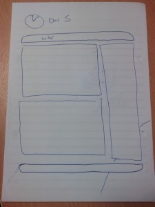
Now, the problem with backgrounds like this is that they do not scroll… at all. So it had to be anchored. And then there’s the issue with different resolutions, perspectives and that CSS2 cannot stretch background images. So after a bit of HTML and CSS trickery I managed to hack together a fake-background that scaled to the browser window. It looks a little blurred on larger resolutions, but I was massively impressed with the effect. Now, at this point, I figured I didn’t want to tarnish my efforts by slapping the old site on top… this new background warranted a new site altogether. So out came the sketch book!
 Now, I’m not a massive fan of fixed width sites. My usual retort is “If a web developer can’t get their site to dynamically scale correctly, then they’re not a very good developer.” However, we now have a sexy space scene to look at that should not be entirely covered up. I actually have a good reason to implement a fixed width site. I also wanted spaces between the various elements to allow the background to show through as much as possible. The the designed I came up with was a simple 2 column site with floating stand-alone elements and the Deadworld logo and title sitting freely above against the background. The footer would obviously be pushed down by the dynamic content and would hardly ever line up correctly, but this is not really a problem… sexy background, remember?
 I chose to go with the white borders and black background because it’s based on the style of the Deadworld Studios logo, which seemed satisfactory. After, tweaking the styles and playing around with the various floating elements, I decided (along with a friend) that the black backgrounds should be transparent as too much of the background was being covered and I was creeping back into the realm of blandness again. I also had to be careful as text on top of images is a big no-no in web design and can make reading pretty hard, so I kept the transparency effect minimal. The resulting effect made the site look a whole lot better.
Anyway, I hope you guys like the new site. At the time of writing there are still a few things that need to be sorted out (such as commenting), so just bear with it for a couple days till I can get it all fixed.
Adios!

